The commission that oversees the Montana State Library decided Wednesday to consider a different color scheme for its new logo after one commissioner argued the original design brought to mind a rainbow LGBTQ pride flag.
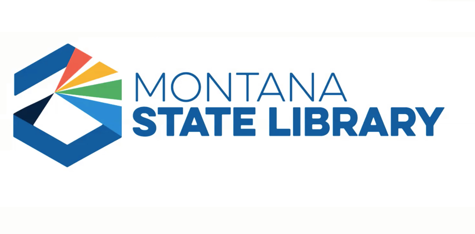
A subcommittee was appointed to develop alternatives after the first logo — which featured a prism emitting four colors — was rejected on a 4-3 vote last month.
Tammy Hall of Bozeman had criticized the colors during a June hearing and suggested the scheme be toned down to shades of blue, black and gray.
Last month, she said her vote in opposition to the logo had nothing to do with the colors and that she thought the logo should be evaluated as part of the state government’s rebranding effort.
Commissioner Kristin Kerr, a member of the subcommittee, said Wednesday the Department of Administration had confirmed that the state’s rebranding effort relates only to the uniformity of websites, not agency logos.
The subcommittee proposed — and the commission agreed — to ask the advertising agency that designed the logo to keep the overall hexagon-shaped design, but present it with two other color schemes that reflect colors found in nature in Montana. The commission will consider the new logos at a meeting later this year.
Supporters of the new logo said it symbolizes the work of the state library, which includes archiving state government, history and geographic information and making it available to the public. The library divested of its book collection starting in 2001.