The online magazine Folio: (which serves the magazine publishing industry) recently compiled a collection of magazine covers featuring the 2008 presidential election. The slide show can be seen (here). How different magazines treated their subject is quite interesting. Some of the covers are outstanding and some are downright unforgivable.
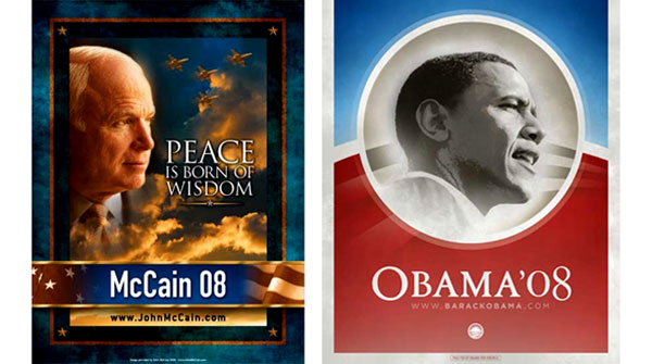
This got me thinking about how each campaign marketed themselves throughout the past year. Here is an example of two campaign posters I could find, one from Sen. John McCain, left, and the other from Sen. Barack Obama.
|
From a design perspective, the Obama campaign is far stronger. It is simple and clean. The Obama “O” (which I think bares a striking resemblance to the London Underground logo) can be run in black in white, color and any size and carries the same weight and message – totally independent of words. In a column for the New York Times, Steven Heller interviews branding expert Brian Collins about the differences between the campaigns marketing and design particularly on the Obama campaign’s use of the typeface Gotham (here).

I have also posted (right) examples of Obama’s “O” and McCain’s campaign sign. I also found it interesting how Obama seemed to embrace more of a pop-culture design. I couldn’t find a McCain equivalent so if I missed an example let me know.