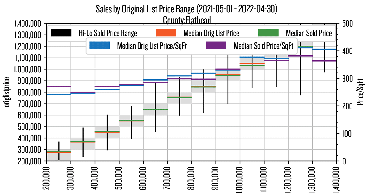
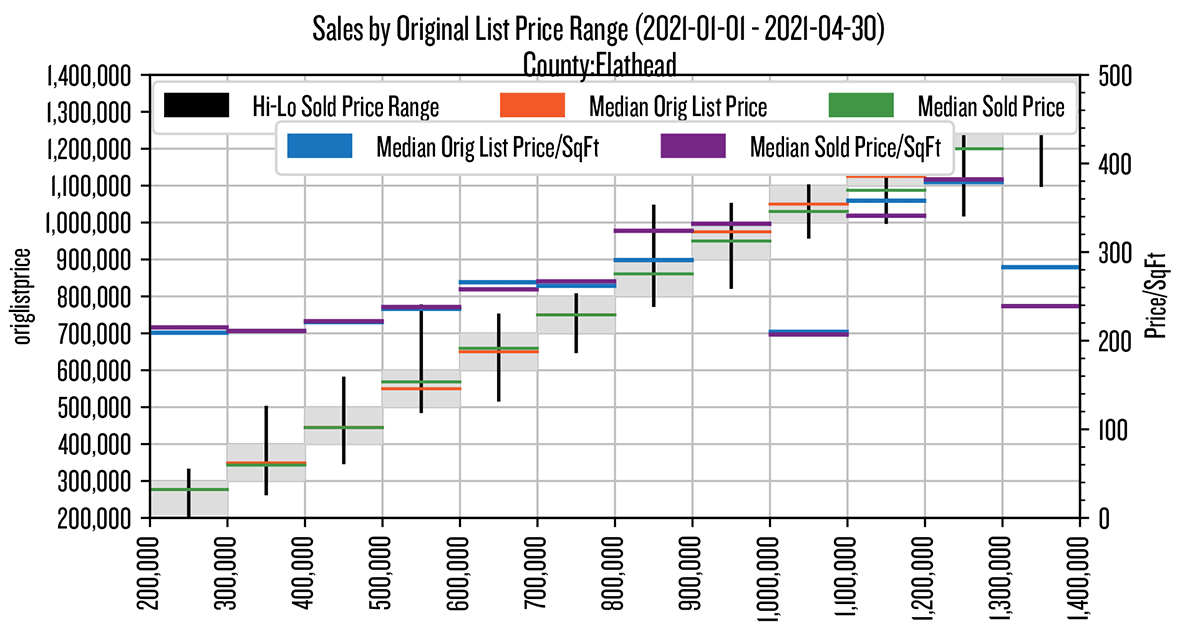
To provide the broadest trend data I can, I am showcasing a complex but inclusive chart as this week’s printed graphic. Online Beacon readers will be treated to additional info, in animated GIFs, detailing: 1) May 2021 through April 2022 (by city) deep dive (like this chart), 2) May 2021 through April 2022 (by city) units sold/DTC, 3) 2021 vs. 2022 first four months countywide comparison deep dive, 4) 2021 vs 2022 first four months countywide comparison of units sold/DTC.
To decipher the printed complex graphic: each gray cell represents activity for a single price ($100,000) range; each gray cell has an associated black vertical line, representing the high and low sold price range for that respective original list price (gray) range; each has an orange and green horizontal line, representing the median original list price and median sold price; each has a blue and a purple horizontal line, representing the median original list and sold price per square foot. Green above orange: selling for more than list; purple above blue: ditto for price per square foot. Blue and purple are the only lines which use the right axis values of $0 to $500.