Commissioners for the Montana State Library voted Tuesday to reject a redesigned logo for the agency, weeks after some commissioners raised concerns that the logo’s color scheme resembled an LGBTQ Pride flag.
The 4-3 vote came after multiple library staffers and members of the public spoke in support of the proposed logo, which designers said was meant to signify a prism. No one who spoke during public comment at the meeting, which was held via a video call, voiced opposition to the new logo.
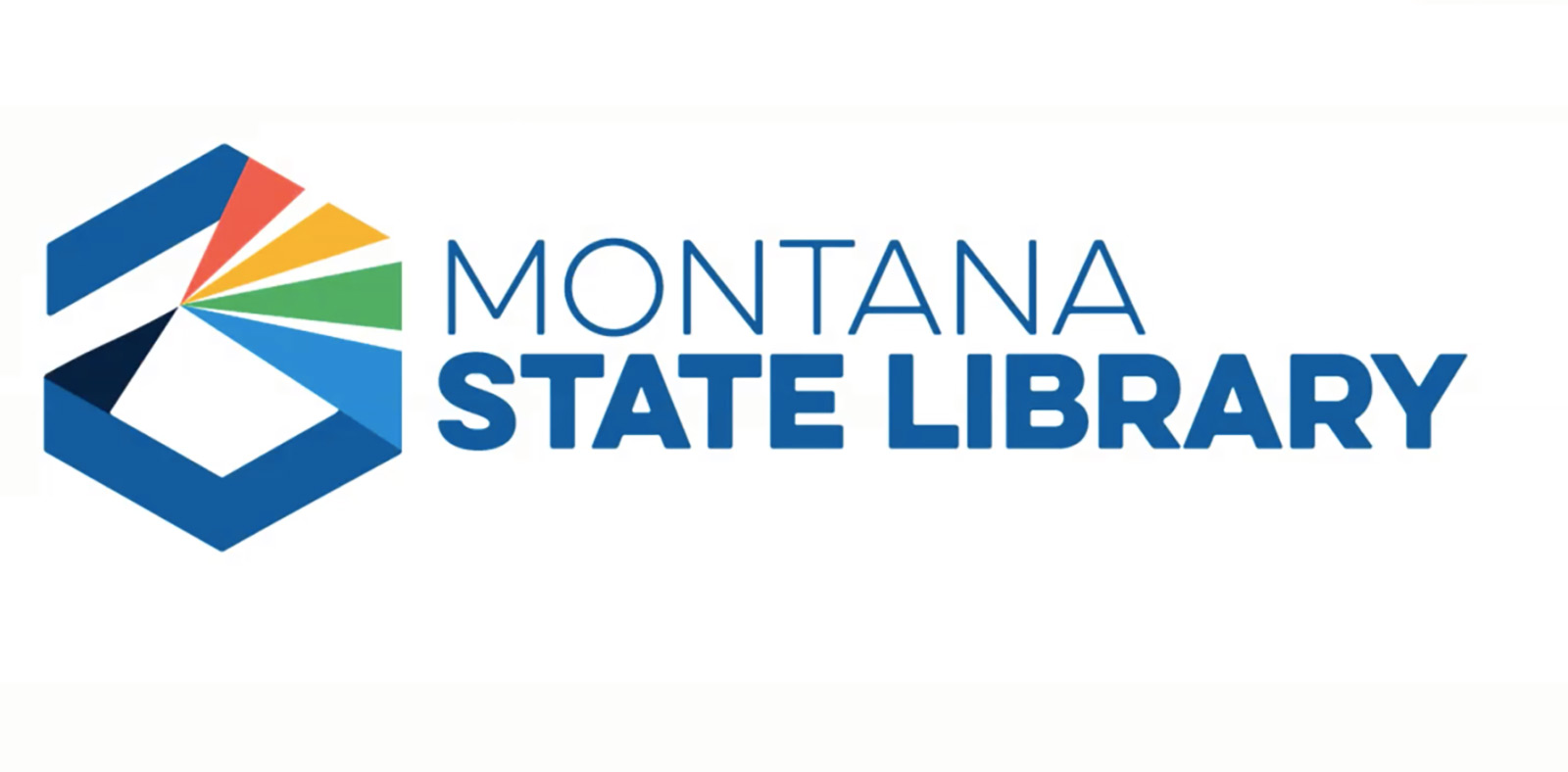
The redesigned logo was unveiled at a June meeting by the Milwaukee-based design firm Hoffman York. The state library’s total contract for the redesign is $298,000, paid from the state library’s private trust rather than from taxpayer dollars allocated by the state Legislature.
Hoffman York has been working on the logo in collaboration with library staff and commissioners for over a year, a process that included multiple rounds of interviews and group brainstorming about possible imagery. Though the design received positive reviews from library staff in May, the commission members debated the logo during the June meeting, with some commissioners saying they were worried it would spark political blowback because of its rainbow imagery.
In a briefing memo prepared in advance of Tuesday’s meeting, library staff members argued that colors and rainbows are “found throughout nature” and are also commonly represented in many corporate and state brands, including the logos for tech companies Google and Microsoft, as well as the Montana Department of Commerce and the Montana Arts Council.
Commissioner and Montana Superintendent of Public Instruction Elsie Arntzen joined commissioners Tammy Hall, Kristin Kerr, and Robyn Scribner in voting against adopting the logo Tuesday. In comments to their fellow commissioners and library staff this week, none of the commissioners mentioned the rainbow colors of the prism as their basis for opposition. Rather, Hall and Scribner said that the logo did not include imagery of books, without which they said the public would not understand the library’s work.
“[I]t has nothing to do with colors, it has nothing to do with the prism. I’d like to make that clear,” said Hall. “I do not see ‘library’ in the design. And I have shared this with, I’d say, probably close to a hundred people, and the number one comment is it doesn’t say ‘library.’”
Hall was the first commissioner to mention the proposed logo’s possible association with the LGBTQ Pride flag at the June meeting. At the time, she said the logo would be “setting us up for a very unnecessary battle politically.”
Hall and the other commissioners who opposed the logo also suggested that, in the future, the state library should work with the office of Gov. Greg Gianforte to ensure that the redesigned logo is complementary to other rebranding efforts happening in state government.
Some pro-logo commissioners and library staff said Tuesday that the logo accurately represents the library’s mission, which includes maintaining public databases, presenting property and natural resource records, and supporting public libraries across the state.
“We are much, much more than a stack of books,” said Sharon Hardwick, the state library’s human resources specialist, during the public comment period. “We are resources, information, directories, maps, technology, government information, natural heritage information and education … I can’t think of a better representation of what the state library is than a prism. A single point where information enters, and exits as a full spectrum of services and resources that truly create a greater state of knowledge.”
Commissioner Dalton Johnson, who voted in favor of the logo along with commissioners Kenning Arlitsch and Peggy Taylor, also urged his fellow members to think broadly about the library’s purpose.
“We are not your traditional library,” Johnson said. “I ask each of you to expand your thinking by imagining an alternative future and going beyond what is safe, stale and culturally determined norms.”
After a motion to adopt the logo failed, some library staff and members of the public observing the meeting expressed their disappointment via written messages typed in the meeting’s virtual comment section.
“While I understand and accept the Commission’s decision, I would like to express my disappointment in today’s vote,” wrote Amelea Kim, a Lifelong Learning Librarian with the state library.
“I am also disappointed in today’s vote,” said Star Bradley, a research librarian who works at Montana State University. “It seems like a waste of time and money to go through this process all over again.”
State Librarian Jennie Stapp told commissioners on Tuesday that the state library has so far spent roughly a third of the total $298,000 allocated for the redesign. The remaining funding was intended to go toward a coordinated brand rollout to communicate the redesign to the library’s users and stakeholders.
The commission did not decide on a list of next steps for the rebranding process after its Tuesday vote. Commissioner Arnzten suggested creating a subcommittee of library staff and commissioners to guide the redesign going forward. That approach, she said, could provide “a healing method” after disagreement between some commissioners and staff.
Arlitsch, the commission’s chair, concurred and said he would work with Stapp to bring a proposal to the commission.
The library commission’s next scheduled meeting is Wednesday, August 3.