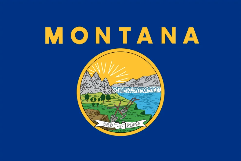
Montana’s state flag is a monstrosity. A banner bereft of bravado, it is an egregious eyesore of an emblem, and nothing short of an aggravated assault on aesthetics.
A Canadian friend of mine once remarked how the cartoonishly illustrated seal, awkwardly centered in the flag’s field of an undefined shade of navy, looks like a “5 year old’s drawing” created in “Microsoft Paint.”
Okay, so maybe it’s not that bad, and obviously a new flag is near the very bottom of our list of priorities of things to fix right now in Montana, but it’s worth noting that the design is a touch ugly and incorporates a number of actual functional shortcomings.
Even the real flag nerds agree. So much so, Montana’s banner was considered the third worst design in all the U.S. and Canada by the North American Vexillological Association in 2001, an assessment cited in House Resolution 24, which called for a study to explore a flag redesign in the last state legislative session, as reported by the Daily Montanan.
The bill failed to advance. We the people must call for a revitalization of this legislation.
Because as it stands, the current flag violates so many principles of practical design, it’s hard to know where to start. The elements within the seal are cluttered and not readily recognizable at a distance, while the golden letters of “MONTANA” read as “ANATNOM” when viewed from the wrong side of a flag pole. Not to mention no fewer than ten other state flags feature a circular seal centered on a box of bland blue.
Meanwhile, a cursory online search reveals elements of the seal appear in a range of inconsistent colors across reproductions of the flag, including neon pink.
The phrase, “Oro -y- plata,” the state motto, is tucked at the bottom of the seal, with what appear to be, for some reason as yet unknown to Spanish or English grammar, hyphens on either side of the “y.” While there are indeed the precious metals of gold and silver in the ground of our state, it’s evident there’s precious little to the flag that presently champions them.
I could go on…
Big Sky Country deserves — no, demands — better!
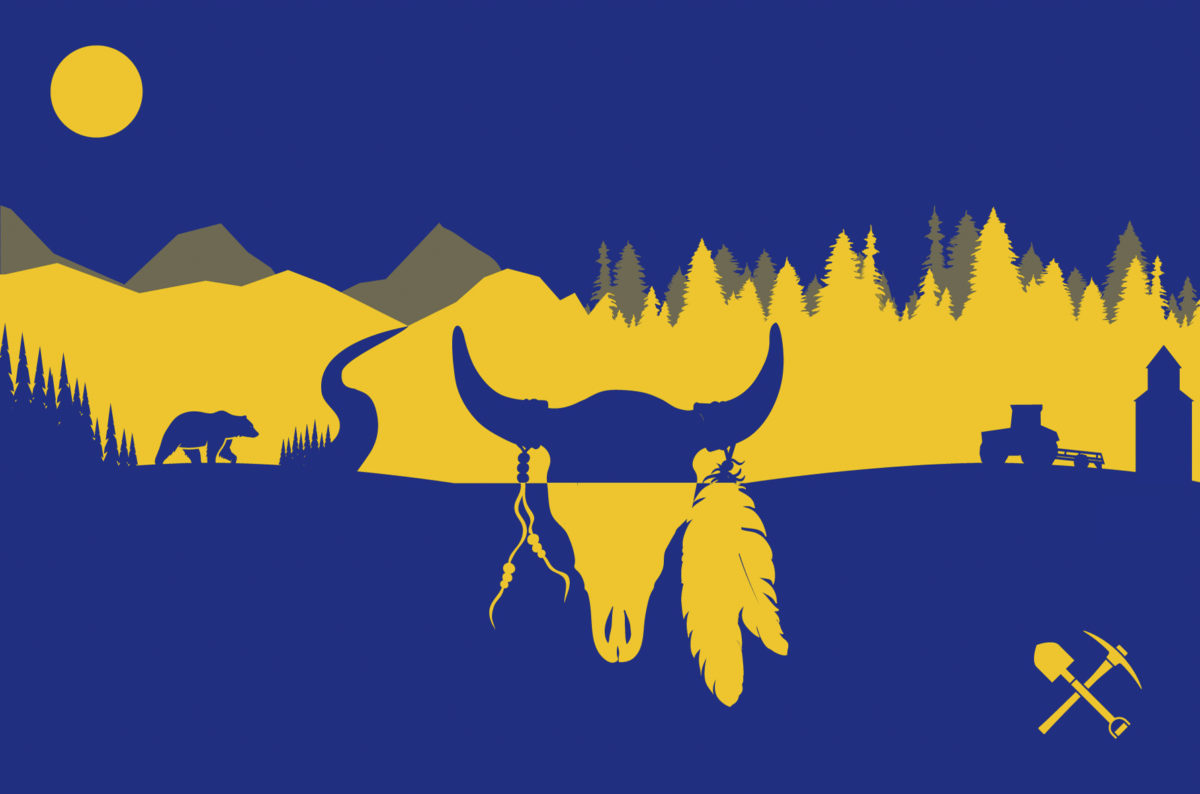
Let’s push for a flag with a fresh design that boldly reflects the remarkable landscapes and the unique artistic and cultural sensibilities of the great people of Montana.
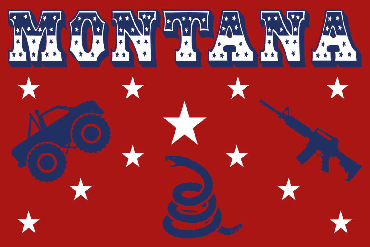
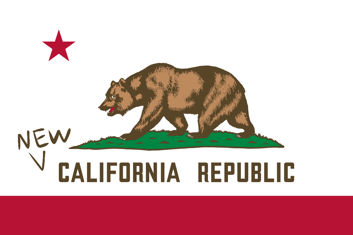
I’ve worked with our talented design staff at the Flathead Beacon to mockup few concepts for a reimagined Treasure State banner, as seen below. A couple of these may be in jest…
Send your designs and ideas for an improved state flag to [email protected].