HELENA — The commission that oversees the Montana State Library voted Wednesday to accept a new logo with colors pulled from the state flag after one commissioner criticized an earlier color scheme as reminding her of a rainbow LGBTQ pride flag.
Commissioners voted 4-2 to approve the new logo, but also decided to pause spending any additional money on the rebranding rollout until December, when they can consider additional information about how that money would be spent.
The commission had voted 4-3 in early July to reject the initial logo after the library paid a company $130,000 in donated library foundation funds to create it as part of a rebranding effort to educate residents about the services the state library provides.
Commissioner Tammy Hall said in June that the original colors brought to mind a pride flag, something she argued could set up an unnecessary political battle as the library seeks funding from a Republican-controlled legislature next year.
Commissioners agreed last month to consider a new color scheme.
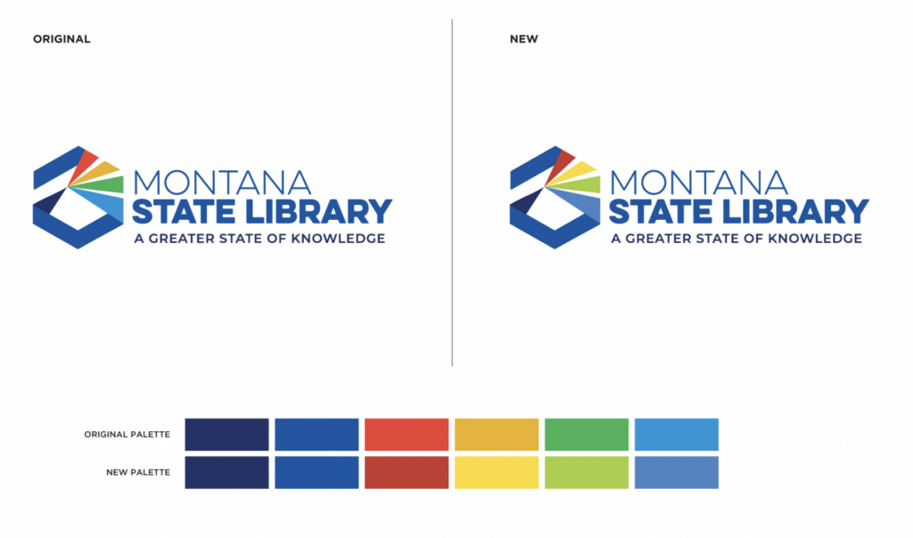
The predominantly blue logo is shaped like a hexagon and is meant to look like information is coming in through a prism and being reflected out as knowledge in four colored triangles.
The rejected logo had triangles colored an orange-red, yellow, medium green and bright blue. The new logo has triangles colored red, bright yellow, yellow-green and a more muted blue — all pulled from the state seal on the Montana flag.
The new logo “beautifully complements our state flag. There’s meaning now behind those colors. It was a vibrant choice,” Commissioner Kristen Kerr said Wednesday in presenting the logo approved by a subcommittee.
Hall had suggested toning the logo down to shades of blue, black and gray and was upset Wednesday when that option was not presented to commissioners.
The proposed logo, which changed “a couple of hues” was a “slap in the face,” Hall said.
Library staff and some commissioners have said the logo symbolizes the work the library does, which includes archiving state government, history, geographic and land information and making it available to the public. The library does not lend books, but offers services to other libraries throughout the state, including an e-book program and an internet hotspot lending program.
Hall said Wednesday she was going to vote against the new logo because it “does not reflect library,” it’s meaning needs to be explained and because of the printing costs of a full color logo.
Addie Palin, with the firm Hoffman York, told commissioners that the contract calls for the agency to provide the state library with a grayscale logo, as well.
Superintendent of Public Instruction Elsie Arntzen, a commissioner who opposed the logo in July but voted in favor of it on Wednesday, made the motion to pause additional spending with the advertising agency to give the commission time to learn more about the rollout costs and benefits.
Hall seconded the motion, questioning why library staff couldn’t handle the rollout work to save money.
State Librarian Jennie Stapp noted the library commission approved the $295,000 rebranding contract with Hoffman York in December 2020, which included the cost of the rollout. Library staff do not have the same expertise as the advertising agency, she said.